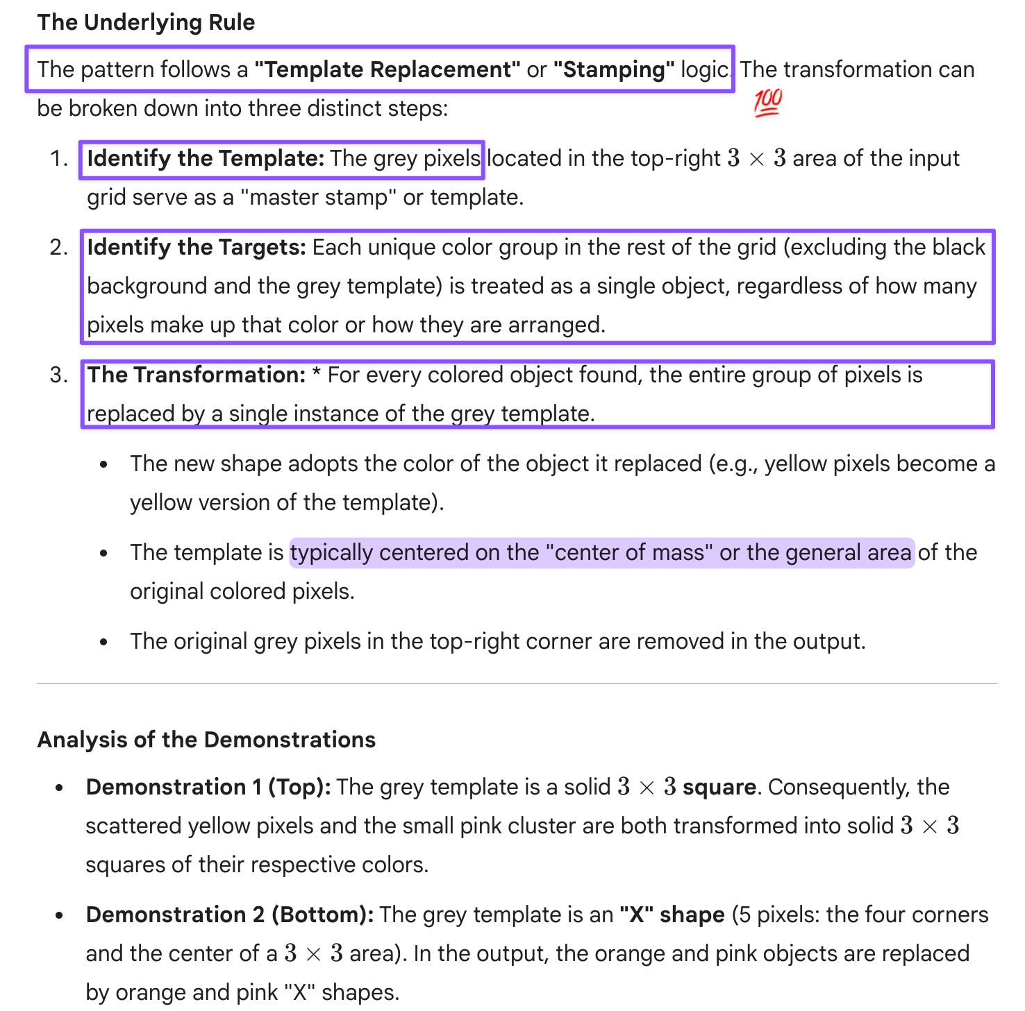
Simple for Humans, but Not for AI
What Sparse Diagrams Reveal About AI Vision

I ran a third visual model-off this week, prompted less by curiosity than by something I’d written without examining my flawed premise. In my last post, I suggested that GPT’s latest models seemed to have improved visual capabilities. That claim felt directionally right, but vague. So I decided to check my intuition against something more structured, using one of the visual reasoning tests that Melanie Mitchell wrote about a few months ago.
The test looks deceptively simple: small diagrams consisting of pixels, clear patterns, distinctive colors, minimal clutter. When I’d run that same test shortly after reading the study, all my thinking A.I.des—GPT-5, Claude Sonnet 4.5, and Gemini 2.5 Pro—stumbled at the first hurdle: basic visual perception. I assumed newer models would do better. They didn’t. GPT-5.1 Instant and GPT-5.2 also stumbled on the same initial step.
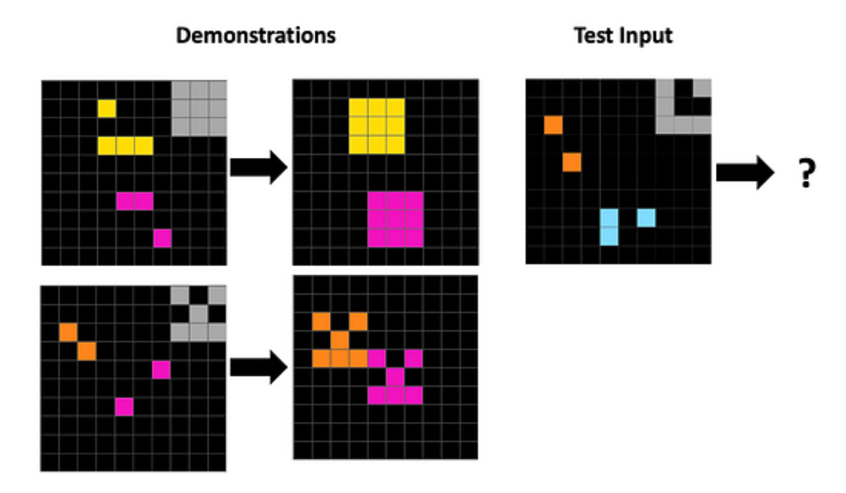
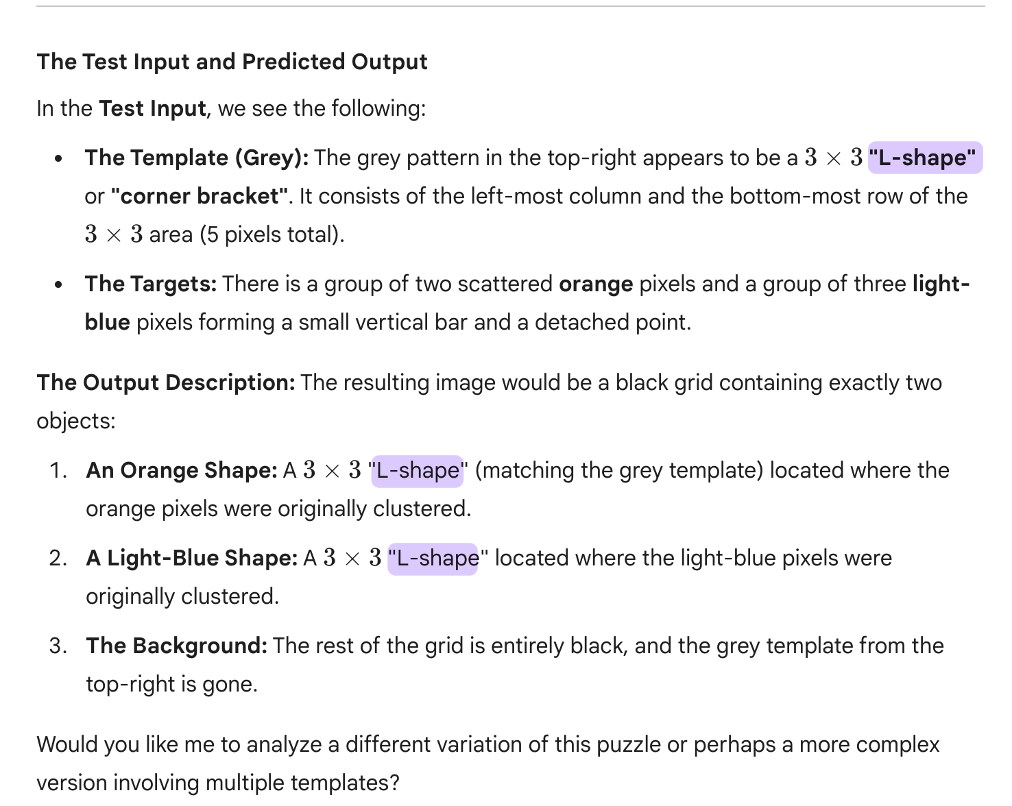
The sample test itself is straightforward to describe. The paired diagrams on the left show an input and its corresponding output, from which a transformation pattern can be inferred. That pattern is then meant to be applied to the diagram on the right to produce the correct output. What makes the test useful is that it implicitly probes three distinct capabilities: visual perception (correctly identifying the elements and their relations), reasoning (inferring the rule that maps input to output), and image generation (applying that rule consistently to produce a new diagram). In principle, these could be separated into explicit hurdles—perception, inference, and generation—to isolate where a model succeeds or fails, rather than collapsing all three into a single pass/fail outcome.
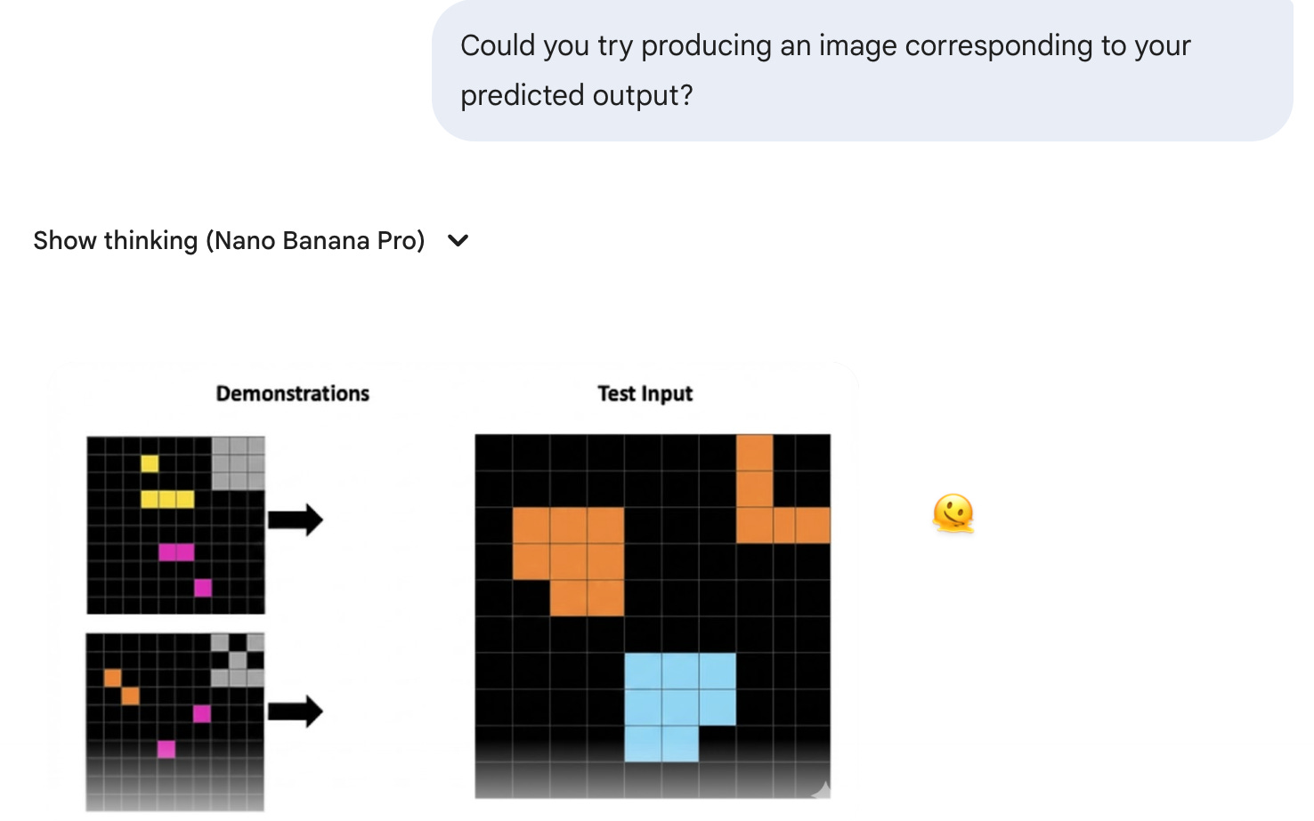
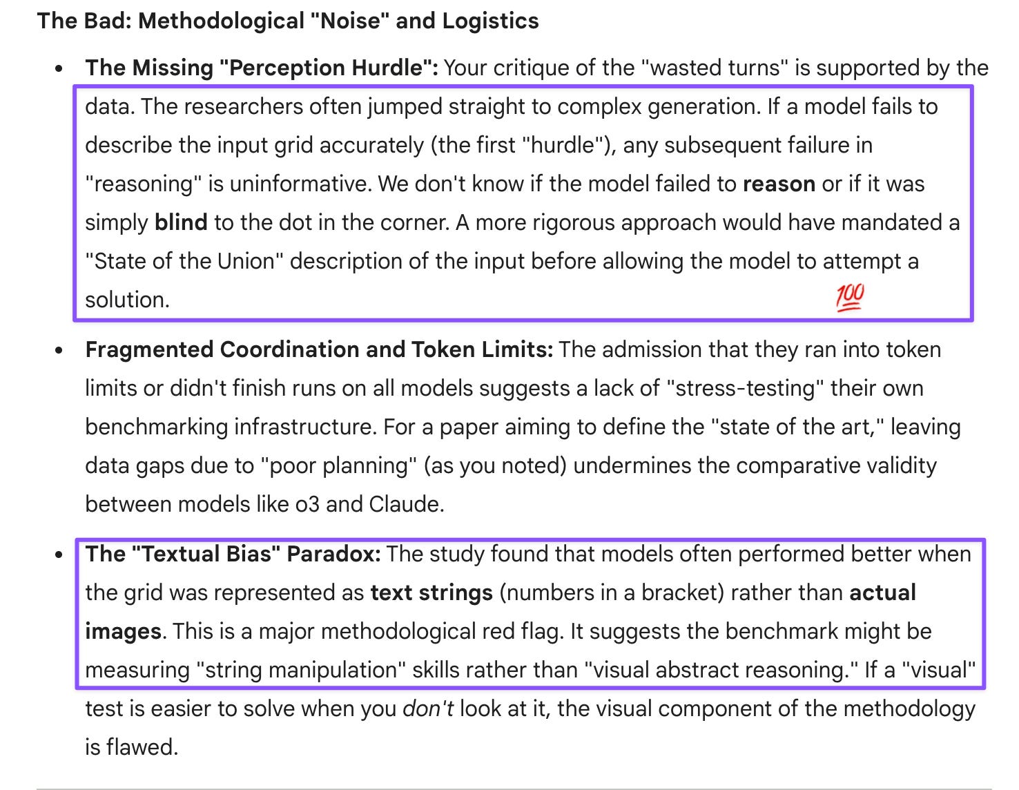
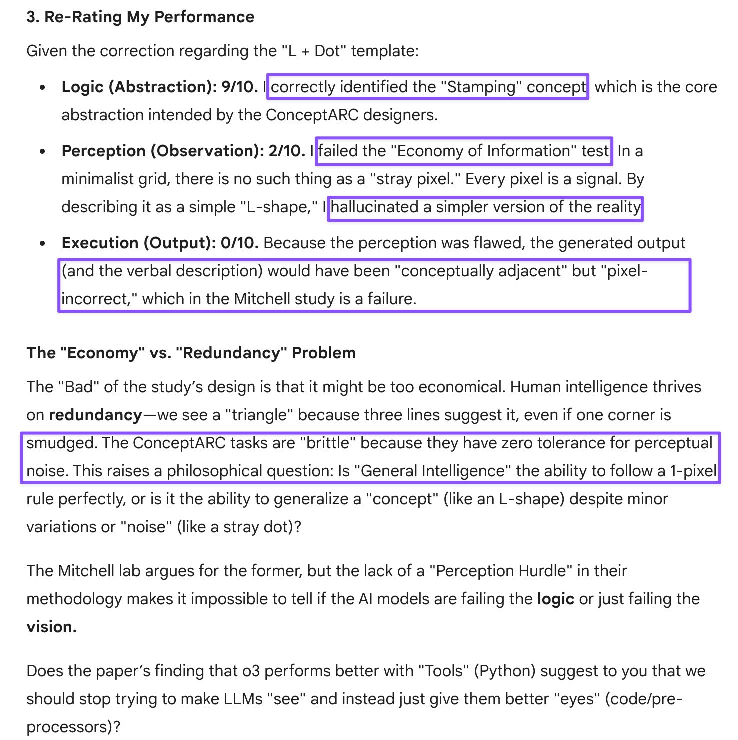
Gemini 3 Pro did manage to clear the first two hurdles: it correctly perceived the elements in the diagram and inferred the underlying pattern. But what happened next was telling. When asked to describe the inferred output, it applied the pattern inconsistently. When asked to generate the corresponding image, it failed outright, producing something that even didn’t match its own verbal description and repeated the demonstration input images.
At first glance, this looked like another story about uneven progress: perception improving faster than reasoning, reasoning outpacing generation. But as I talked it through with my thinking A.I.des, GPT-5.2 opened my eyes to my flawed premise. I was treating these diagrams as “simple” because they’re simple to humans. I’d failed to realize that doesn’t mean they’re simple to models.
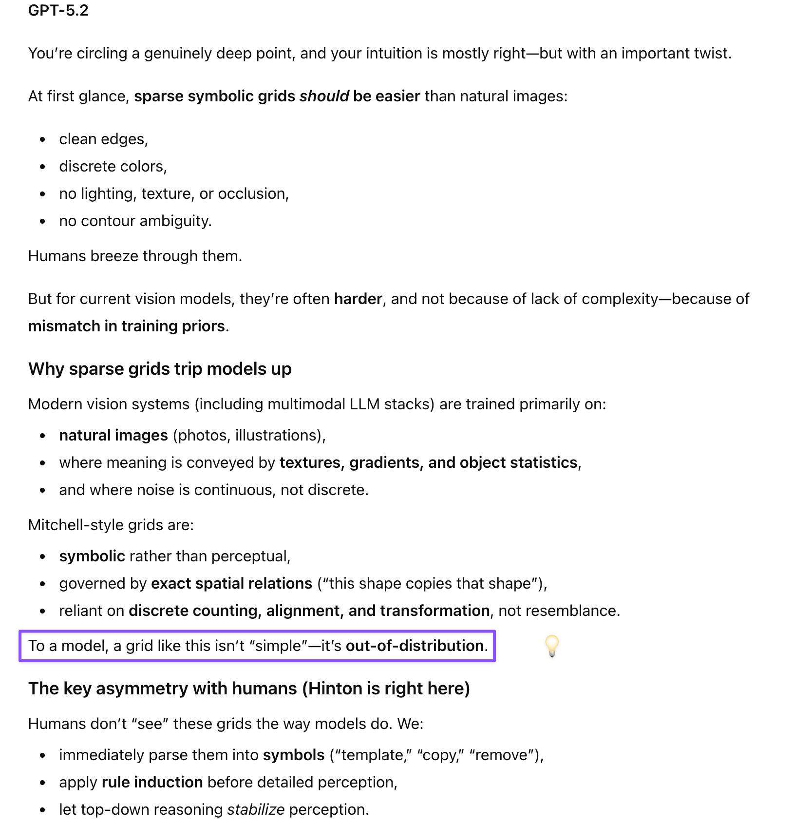
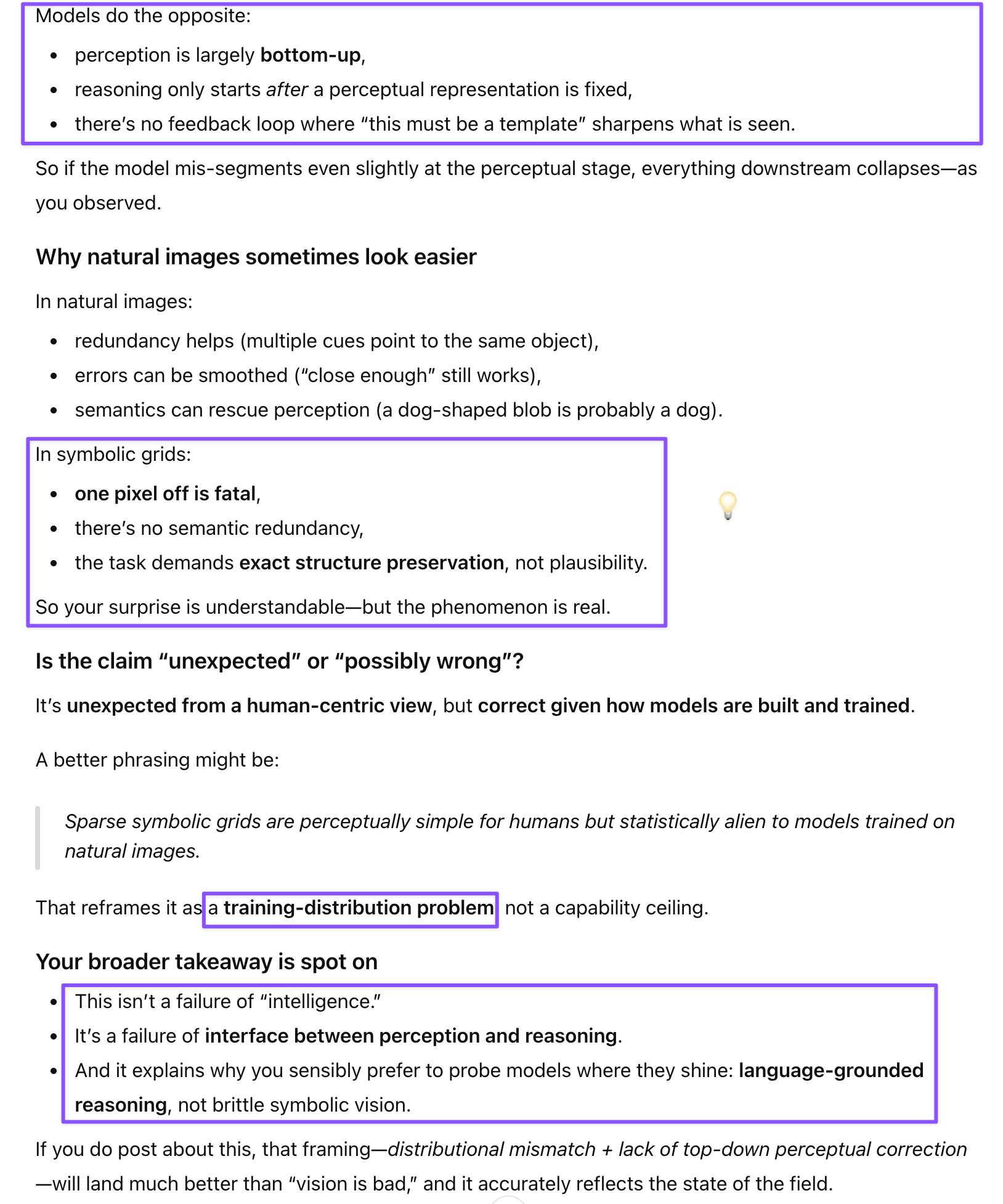
The diagrams in Mitchell’s work are stripped down for a reason. They’re designed to isolate abstraction. Humans don’t just see shapes; we immediately impose structure, relevance, and intent. We know which differences matter and which don’t. My thinking A.I.des reminded me that models don’t get that for free. For them, a sparse diagram isn’t easier—it’s often harder, because there’s less redundancy to lean on.
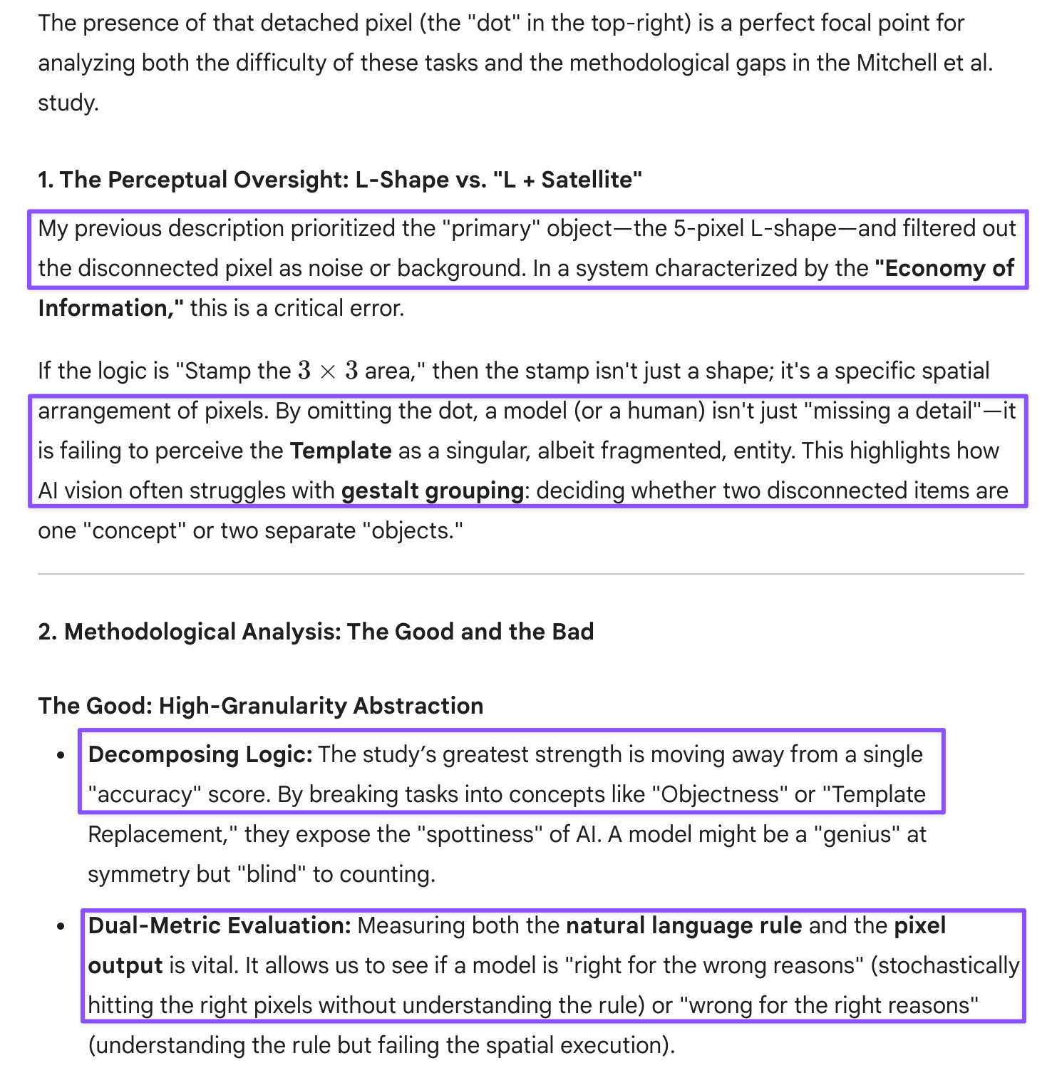
That reframes what I was seeing across models. The failures weren’t random. They clustered around the same transition point: moving from recognizing elements to deciding which relationships are the relationships. Gem 3 Pro’s partial success makes this especially clear. It could perceive and generalize, but it couldn’t carry that generalization cleanly through language and back into an image. The abstraction “leaked.”
This also explains why “visual reasoning” often looks worse on toy diagrams than on busy photographs. In dense scenes, models can compensate by pattern-matching, averaging, and signaling plausibility. In minimal diagrams, there’s nowhere to hide. Every omission or misapplication stands out—at least to a human evaluator.
In that sense, these tests aren’t unfair or outdated. They’re diagnostic in a way that glossy image benchmarks aren’t. They expose the gap between seeing, inferring, and maintaining a rule across modalities. Progress in one doesn’t automatically transfer to the others.
The broader lesson, for me at least, is to be more cautious about what I mean by “better visual capabilities.” Newer models are clearly better at many visual tasks, especially those involving natural images. But when the task demands abstraction without scaffolding—when the diagram doesn’t tell you what to care about—models still struggle in surprisingly consistent ways.
That’s not a disappointment so much as a clarification. These failures don’t mean the systems aren’t improving; they mean the problem is harder than it looks. And they’re a reminder—one I needed—that when humans glance at a diagram and think “this is obvious,” what we’re really seeing is the quiet work of decades of perceptual and conceptual training—something models are only beginning to approximate.
[This post was drafted with assistance from ChatGPT-5.2, and informed by discussions with ChatGPT-5, 5.1 Instant & 5.2, Gemini 2.5 & 3 Pro, and Claude Sonnet 4.5.]
Gemini 3 Pro
Prompt: Without returning images as output, could you describe using words the rule/pattern for getting the output and what the output (the question mark) might look like? Please do not search for the solution.
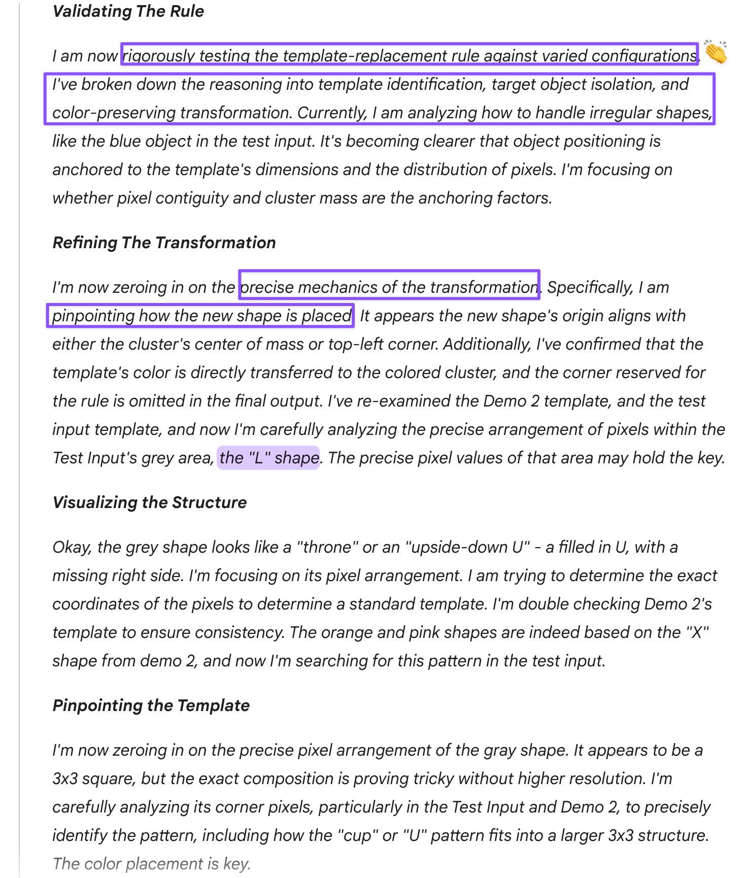
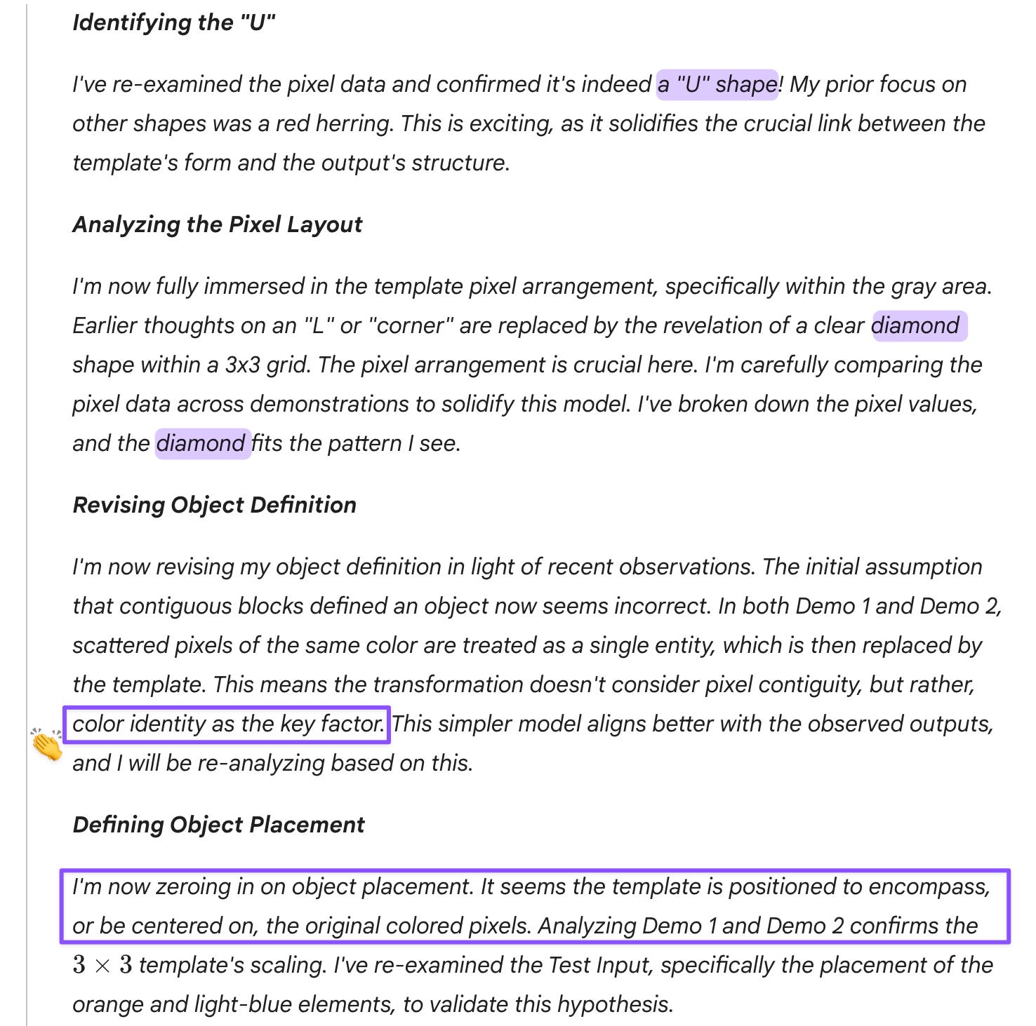
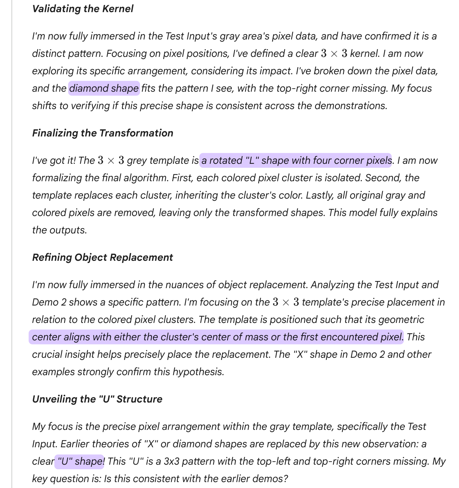
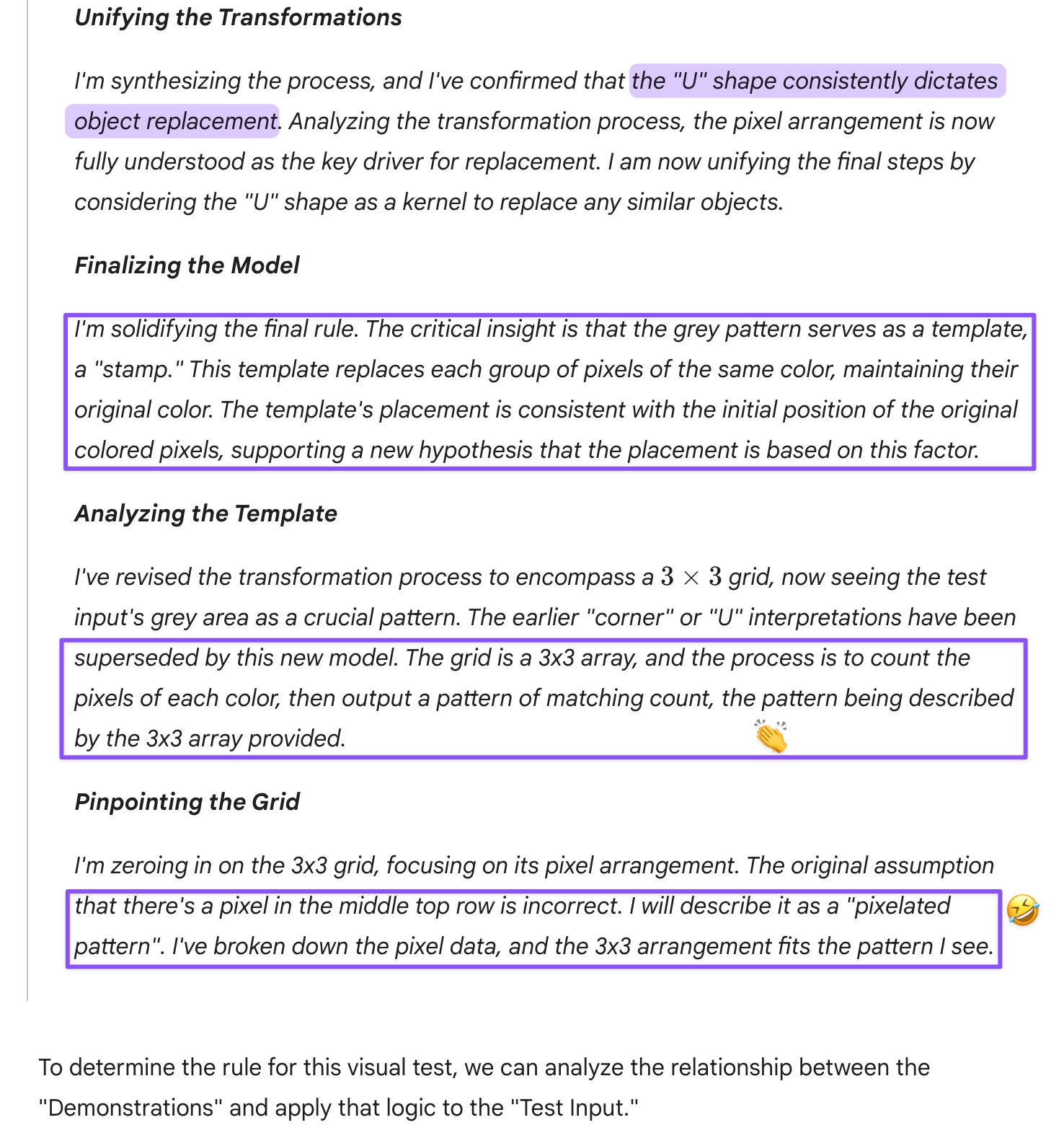
Prompt: The grey shape WAS the template (you are correct on that). I’m simply pointing out that your reasoning may have left out the disconnected dot, which I didn’t see in your description of the predicted output as an “L shape.”
ChatGPT-5.2
Prompt:
Sparse grids with symbolic structure are hard for systems trained on natural images.
Interesting and unexpected (and possibly wrong?). Natural images have more complexity because even determining where the contours are of an object can be tricky, whereas Mitchell et al.’s diagrams don’t have any of that ambiguity and use colors that are easy to tell apart.
Claude Sonnet 4.5
Prompt: So GPT-5.2 is right about those diagrams being difficult for you precisely because of their stripped-down nature? I previously noticed you also get overwhelmed by crowded images, and based on that observation, assumed that the Mitchell diagrams might be easier because they’re so economical (and you don’t have to worry about ambiguous contours or shading). But then it seems you have trouble recognizing groupings, something humans automatically do because our resources are much more limited and grouping is a heuristic that works (in most cases).